Network Visualization
Style
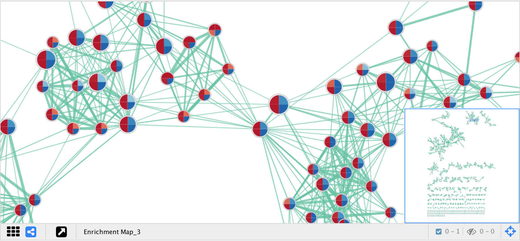
EnrichmentMap creates a separate visual style for each network. The visual style has the following characteristics:
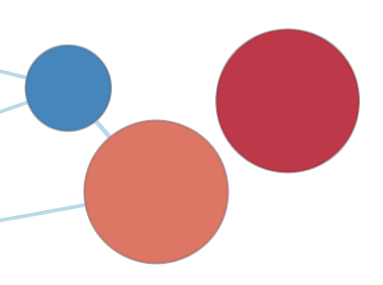
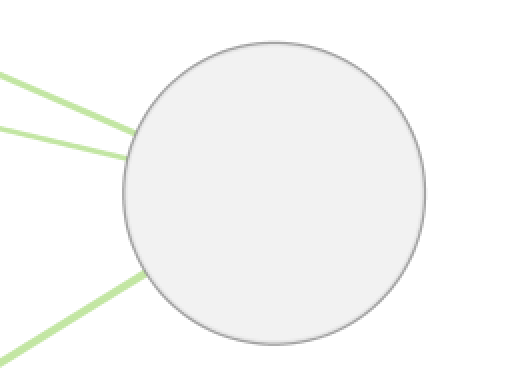
Nodes represent gene sets.
Node size represents the number of genes in the gene set.
Edges represent overlap (similarity) between gene sets.
Edge width represents the number of genes that overlap between a pair of gene sets.
Node fill represents…
Enrichment scores, such as NES (for GSEA), p-value or q-value.
When there is only 1 data set selected the enriched phenotype is conveyed using a color gradient.
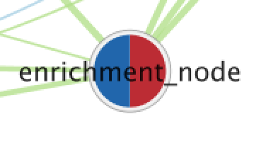
When there are 2 or more data sets then nodes are overlayed with charts, where each segment of the chart shows enrichment using a color gradient.
Data set membership
The Color by Data Set chart shows which data sets a gene set is a member of.
The network is arranged by a force directed layout which causes gene sets with high overlap to cluster together.
If the AutoAnnotate app is installed, then it will be used to find clusters of highly similar gene sets, and the most significant node in each cluster will be highlighted with a larger label. For more information see: Finding Clusters with AutoAnnotate

Expression data is visualized in a separate panel called the Heat Map panel. For more details see Heat Map Panel.
Visual Properties
Warning
EnrichmentMap automatically maintains the visual properties described below. If you manually change these visual properties EnrichmentMap will overwrite your changes. If you want to create a custom visual style you must first create a copy and then make changes to the copy.
Visual properties are available on the Style tab of the Control Panel.
Node Visual Properties
There are two types of nodes:
Enrichment gene set nodes
Regular gene set nodes that are created when the network is first created.
Enrichment nodes can have many different visualizations depending on the settings in the Style section of the Main Panel.
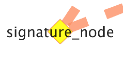
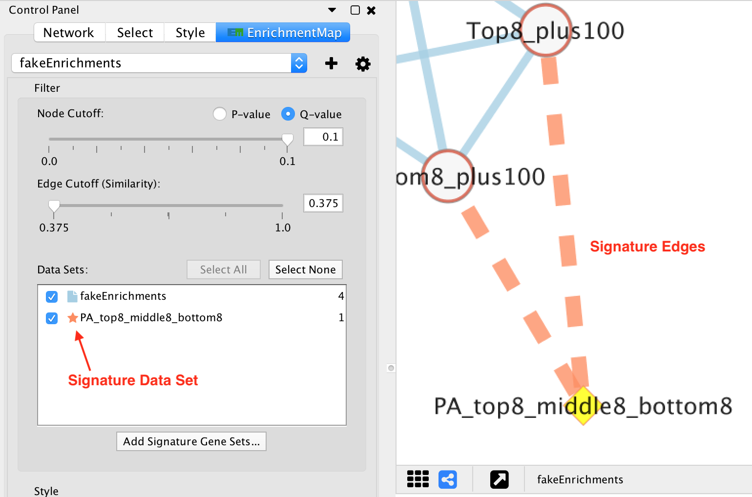
Signature gene set nodes
Added to an existing network by Post Analysis (Add Signature Gene Sets).
Do not have chart visualizations.
Edges connected to signature nodes are dashed.
Enrichment
Signature
Visual properties
Visual Property |
Meaning |
Type |
Column(s) |
|---|---|---|---|
Shape |
Gene Set Type |
Discrete Mapping |
EnrichmentMap::GS_Type (ENR = Square, SIG = Diamond) |
Fill Color |
NES, p/q-value |
Discrete Mapping |
EnrichmentMap::pvalue, EnrichmentMap::fdr_qvalue, EnrichmentMap::NES |
Label |
Gene set name |
Passthrough Mapping |
EnrichmentMap::GS_DESCR |
Size |
Size of gene set |
Continuous Mapping |
EnrichmentMap::gs_size |
Image/Chart 1 |
NES, p/q-value |
Chart |
EnrichmentMap::pvalue, EnrichmentMap::fdr_qvalue, EnrichmentMap::NES |
Edge Visual Properties
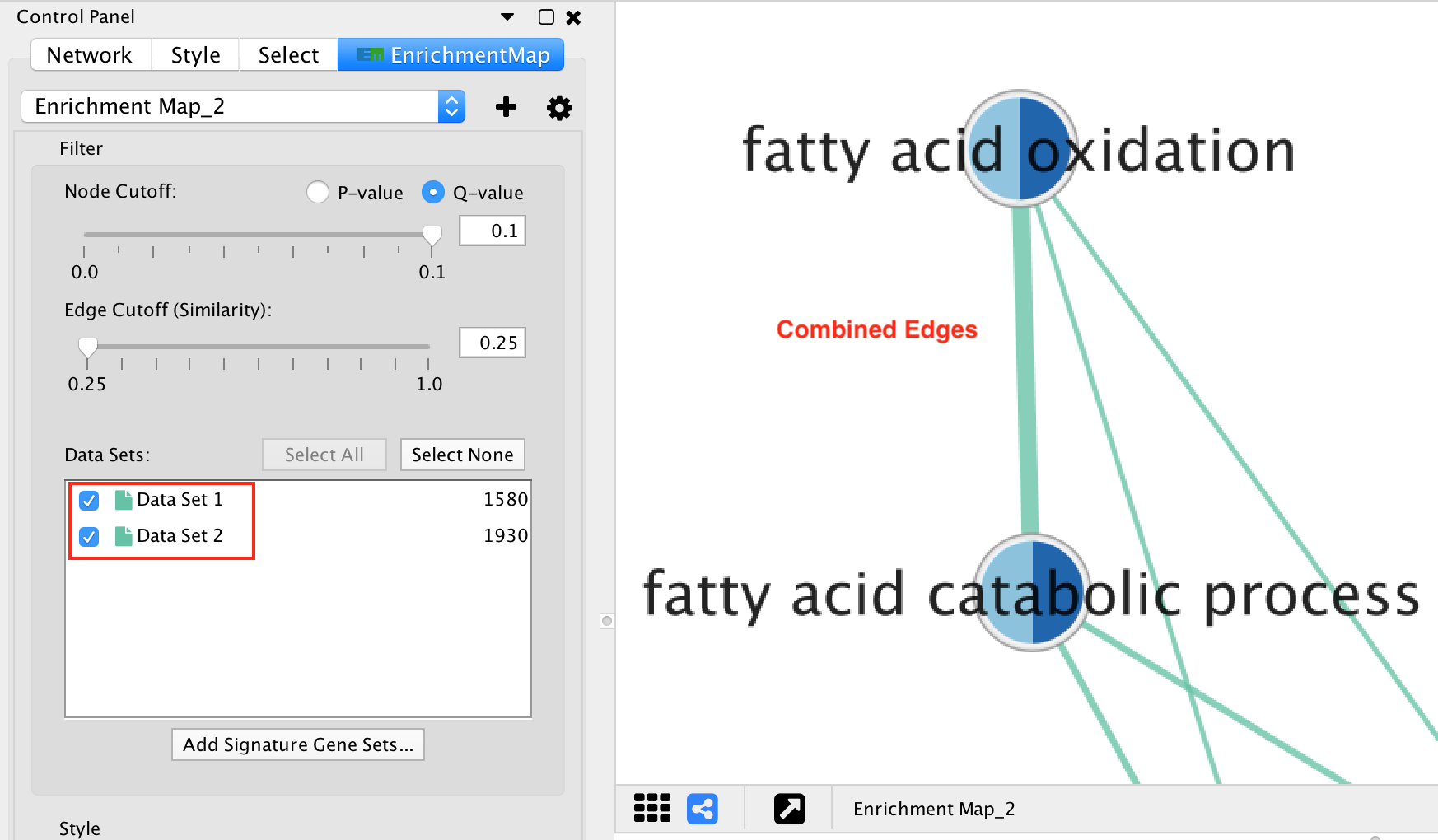
If there are 2 or more data sets, or the Separate edge for each data set option was chosen, then edges will have different colors for each data set. The edge color corresponds to the color of the icon next to the data set name in the main panel.
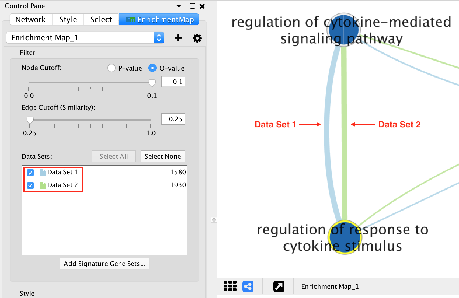
If the network has only one data set, or if the Combine edges across data sets option was chosen, then all the edges between enrichment gene sets will be the same color.
Edges connected to signature gene sets have a different color and are dashed.
Visual properties
Visual Property |
Meaning |
Type |
Column(s) |
|---|---|---|---|
Line Type |
Edge Type |
Discrete Mapping |
interaction (default = solid, sig = dashed) |
Stroke Color |
Data Set or Signature |
Discrete Mapping |
EnrichmentMap::Data Set |
Width |
Size of gene set overlap |
Continuous Mapping |
EnrichmentMap::similarity_coefficient |
Chart Visualization
There are 6 types of chart visualization available (including None).
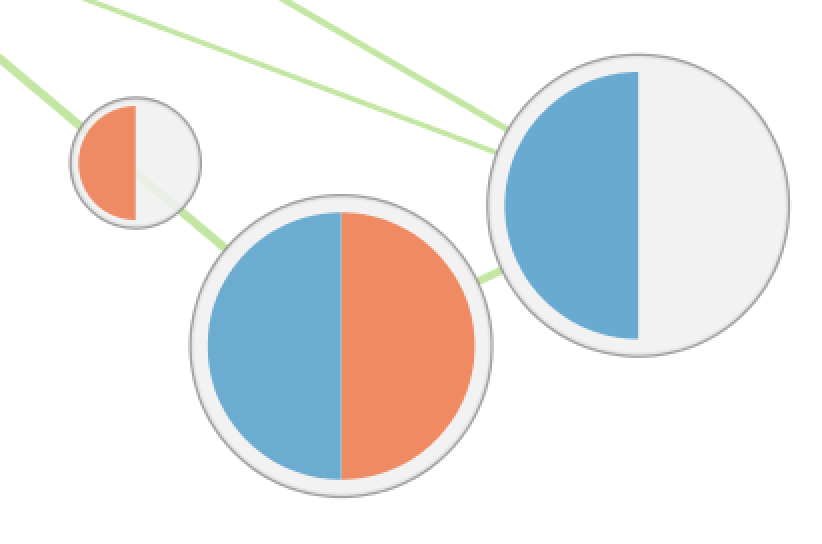
Color by Data Set
Color by Data Set |
|
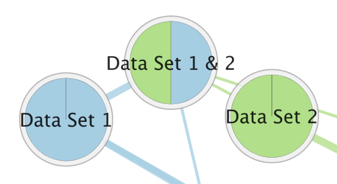
The Color by Data Set pie chart shows which data sets each gene set is a member of. The segment color corresponds to the color of the icon next to the data set name in the main panel. These colors can be changed by selecting the Change Colors button under the Data Set list in the Main Panel.
Enrichment
There are 3 charts available for visualizing enrichment values.
Radial Heat Map |
Heat Map |
Heat Strips |
|---|---|---|
|
|
|
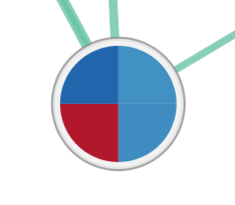
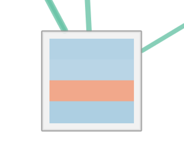
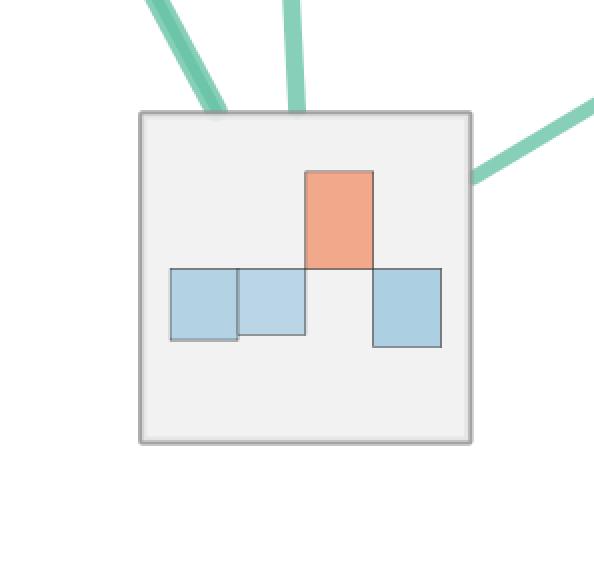
For Radial Heat Map and Heat Map each segment of the chart is equal size and represents the enrichment value from one data set. For Heat Strips the size of each segment also reflects the enrichment value.
The color of each chart segment is a color gradient indicating the enrichment value. The default color scheme shows up-regulated scores in red and down-regulated scores in blue.
g:Profiler Phenotypes
There is a special chart called Phenotypes that is only available for g:Profiler 2-data set analysis.
Phenotypes |
|
The color gradient of each segment indicates the enriched phenotype, calculated using the formula 1 - pvalue multiplied by the sign of the ES score (if using GSEA mode) or the phenotype (if using the Generic mode).
This color gradient is similar to the visualization used by EnrichmentMap 2.0.
None
None, 1 Data Set |
None, 2+ Data Sets |
|---|---|
|
|
If there are 2 or more data sets then selecting None will show a dull gray color on each node that has no meaning.
If there is exactly 1 data set selected then the node fill color will be a color gradient that indicates the enriched phenotype, calculated using the formula 1 - pvalue multiplied by the sign of the ES score (if using GSEA mode) or the phenotype (if using the Generic mode).
This color gradient is similar to the visualization used by EnrichmentMap 2.0.
Legend
The legend dialog can be used to see which chart segment corresponds to which data set and the meaning of the colors.
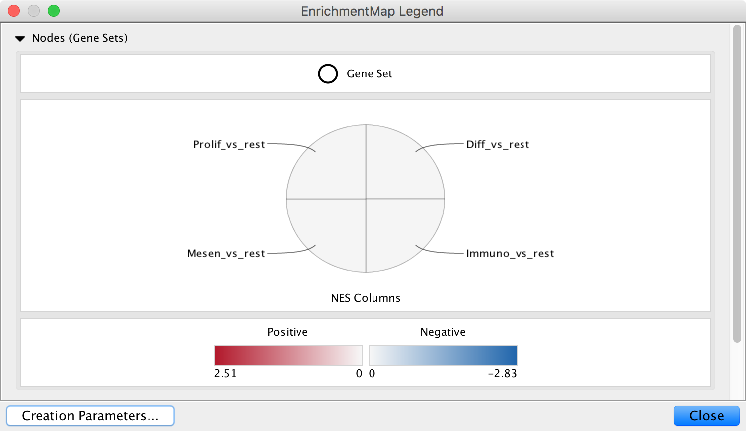
Use the Style section of the Main Panel to change the type chart and the color scheme.
