- align:
right
Main Panel
The main EnrichmentMap panel has the following sections:
Toolbar
Filter section
Style section
Each of these sections will be explained in more detail below.
If the main panel is not visible go to the Cytoscape main menu and select Apps > EnrichmentMap.
To hide the panel click the Close button at the bottom right.
1) Toolbar

Network combo box
This combo box can be used to quickly switch between EnrichmentMap networks without having to navigate to the Network tab. Only networks created by EnrichmentMap are listed.
Plus button

Opens the Create EnrichmentMap Dialog.
Gear button

Opens the panel menu (explained in more detail below).
Panel Menu
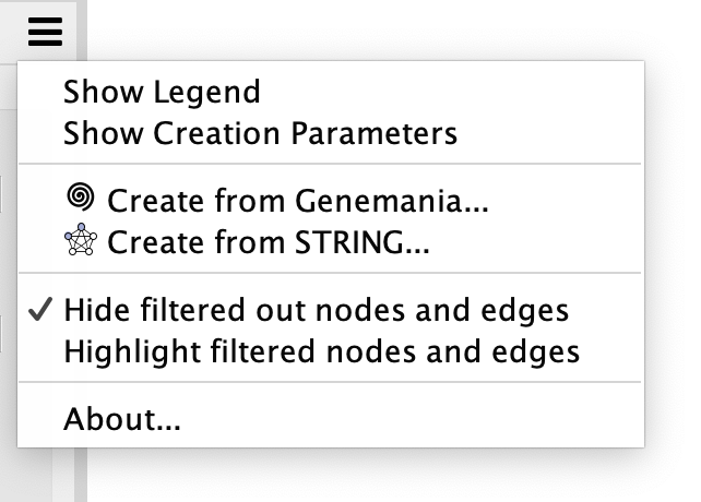
Show Legend
Opens the Legend Dialog.
Show Creation Parameters
Opens the Creation Parameters Dialog.
Create from Genemania…
Creates an EnrichmentMap network from annotation data stored in a Genemania network.
Create from STRING…
Creates an EnrichmentMap network from enrichment data stored in a STRING network.
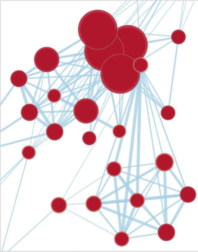
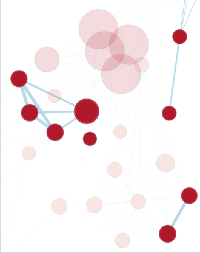
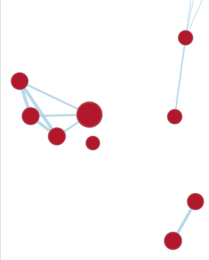
Hide/Highlight filtered nodes and edges
Changes the appearance of nodes and edges that are filtered out. See 2) Filter Section below.
No Filter |
Highlight |
Hide |
|---|---|---|
|
|
|
2) Filter Section
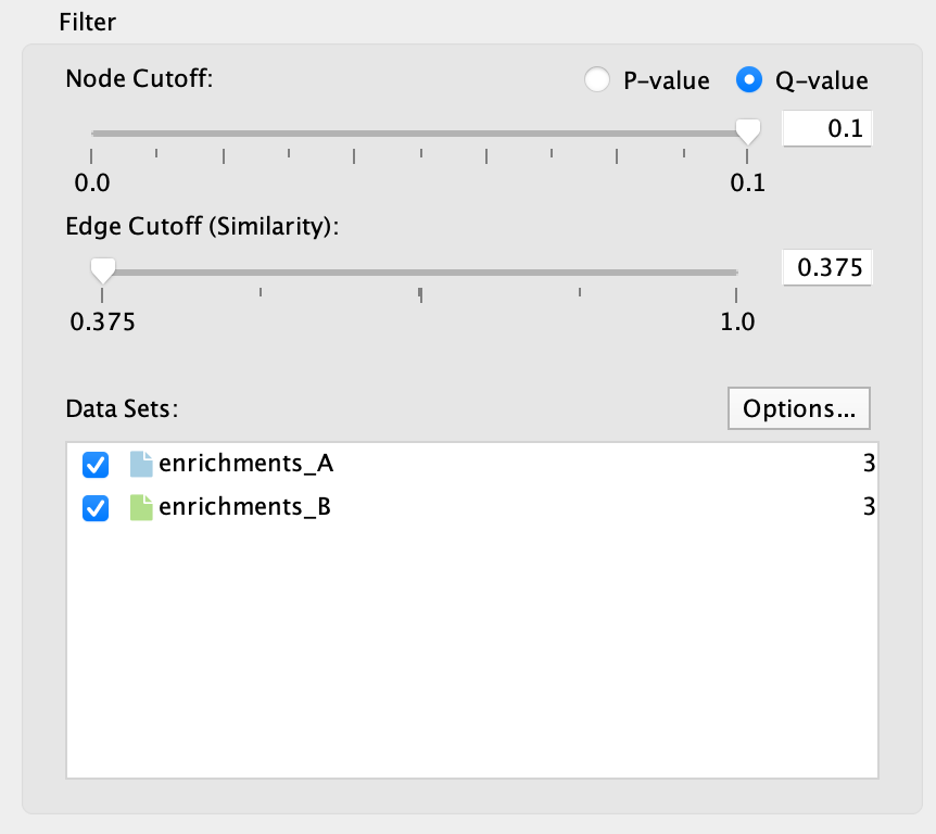
The filter section is used to hide nodes and edges in the network.
Node cutoff
Use the radio buttons to switch between p-value and q-value.
The slider is initially set all the way to the right, which corresponds to the value that was entered in the Create EnrichmentMap Dialog when the network was created.
As the slider is moved to the left nodes with a p-value/q-value greater than the cutoff are hidden. Edges connected to hidden nodes are also hidden.
P-values can be found in the Node Table in columns that start with pvalue.
Q-values can be found in the Node Table in columns that start with fdr_qvalue.
Edge cutoff
This slider is initially set all the way to the left, which corresponds to the smallest edge similarity score in the network.
As the slider is moved to the right edges with a similarity score less than the cutoff are hidden.
Similarity scores can be found in the Edge Table in the column named similarity_coefficient.
Data Sets list
The data set list shows then names of all the data sets as well as the number of gene sets in each data set.
Initially the checkbox next to each data set is selected.
De-selecting the checkboxes hides gene set nodes that are only contained in those data sets.
Options button: Opens a pop-up menu with options for working with Data Sets.
Change data set colors
Opens a color chooser pop-up for choosing the colors used for each data set. This will change the color of the network edges, colors of the ‘Color by Data Set’ chart, and the table header in the Heat Map panel.
Add Signature Gene Sets
Opens the Post Analysis (Add Signature Gene Sets) dialog.
Highlight data sets for selected nodes and edges
When selecting nodes or edges in the network the corresponding data sets will be highlighted. This makes it easy to know data set membership. Select this option to turn this feature on/off.
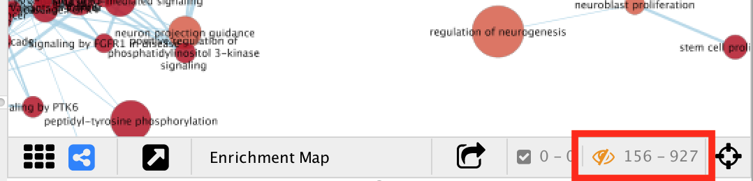
The number of hidden nodes and edges can be seen in the status bar under the network view.
3) Style Section

The style panel is mainly used to manipulate chart visualizations on nodes.
For more details on chart visualizations see Chart Visualization.
Chart Data
– None –
If there is 1 data set then node shows a pre-computed color gradient for the p-value. If there are 2 or more data sets then the node color has no meaning and is set to grey.
NES Columns
Enrichment values from the NES columns are used.
Only available if the analysis type is GSEA.
P-value Columns
Enrichment values from pvalue columns are used.
-log10(pvalue) Columns
Values from -log10(pvalue) columns are used.
-log10(pvalue)*sign(NES) Columns
Values from -log10(pvalue)*sign(nes) columns are used.
Q-value (FDR) Columns
Enrichment values from fdr_qvalue columns are used.
Color by Data Set
Pie chart that shows which data sets each gene set is a member of.
Phenotypes
Only available for g:Profiler 2-data set analysis.
The color gradient of each chart segment indicates the enriched phenotype.
Chart Type
Field is enabled if Chart Data is set to NES Columns, P-value Columns or Q-value Columns.
Various chart types are available, for more details see Chart Visualization.
Color Scheme
Several Color Brewer colorblind safe palettes are available.
When NES Columns is chosen for Chart Data then the RdBu-9 palette will be available. This palette is the same as the standard color gradient used in EnrichmentMap 2.0.
Show chart labels
Enable this option to show enrichment values for each chart segment.
Publication-Ready
Makes the network view ready for printing. Removes node labels and sets the network background to white.
Show Legend button
Shows the legend dialog.
Reset Style button
Resets the visual style.
Sometimes Cytoscape does not update the visual style properly. To fix any inconsistencies between the network view and the Style section of the main panel click this button.
Find Clusters button
Uses the AutoAnnotate app to find clusters of highly similar nodes.
For more information see Finding Clusters with AutoAnnotate.