Quick Tour
Creating the Network
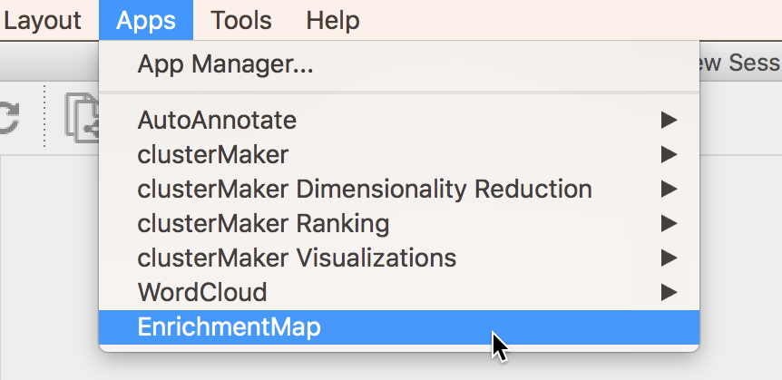
To create an Enrichment Map network go to the Cytoscape main menu and select Apps > EnrichmentMap.
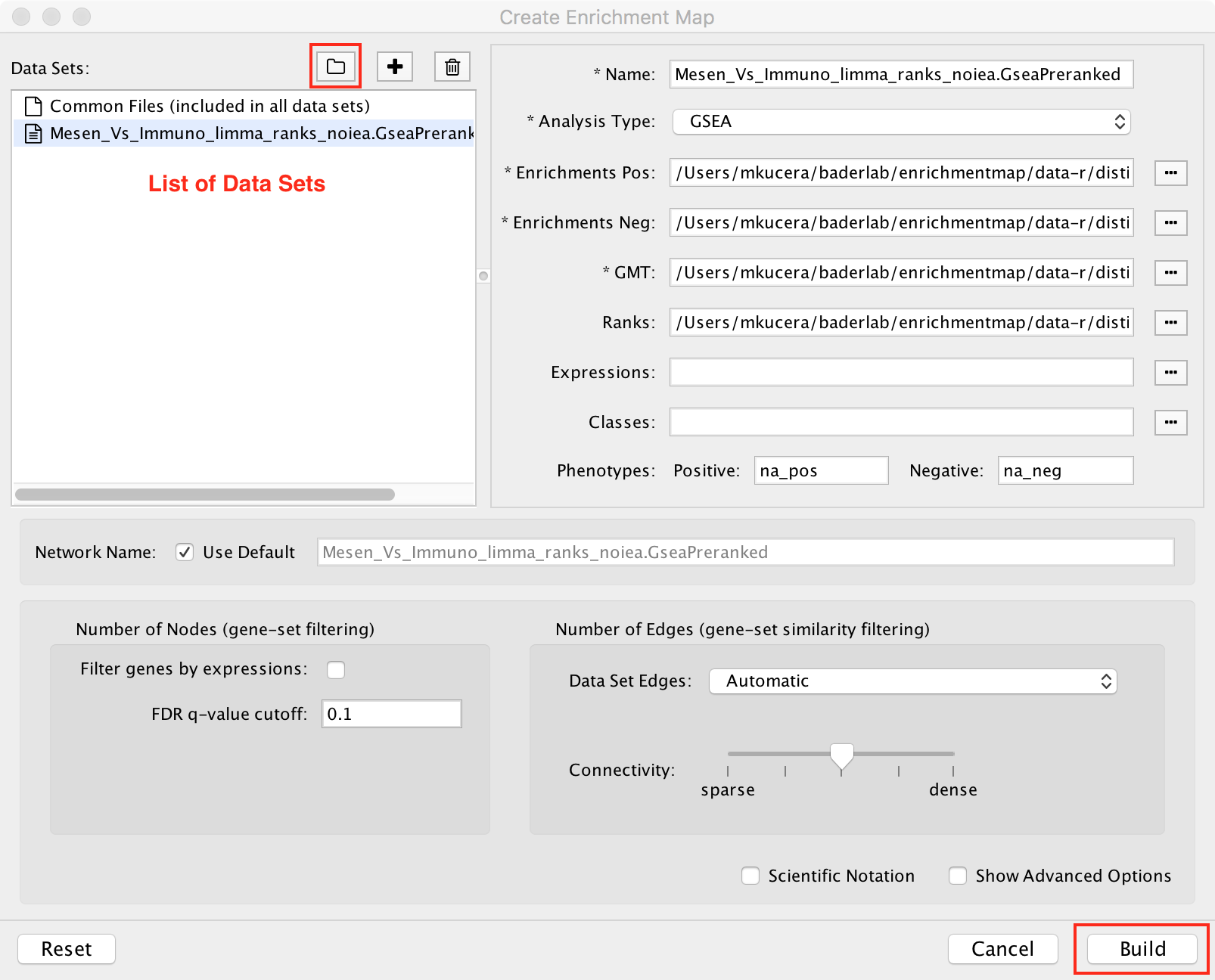
This will show the EnrichmentMap panels and open the Create EnrichmentMap Dialog.
Note
If the Create EnrichmentMap Dialog does not appear then click the (+) icon at the top of the EnrichmentMap Main Panel.
The quickest way to import data is to scan a folder for enrichment analysis data files (for example a GSEA results folder).
Click the ![]() icon and select a folder. EnrichmentMap will scan the folder
for files containing enrichment data, expression data, ranks, classes and gene set definitions.
These files will be arranged into a List of Data Sets, each of which contains the data for
one experiment. Click the Build button to create the network.
icon and select a folder. EnrichmentMap will scan the folder
for files containing enrichment data, expression data, ranks, classes and gene set definitions.
These files will be arranged into a List of Data Sets, each of which contains the data for
one experiment. Click the Build button to create the network.
Note
New in Cytoscape 3.1: You can initiate a scan by dragging and dropping folders onto the Data Sets List.
Note
For more details see Creating a Network
Panels
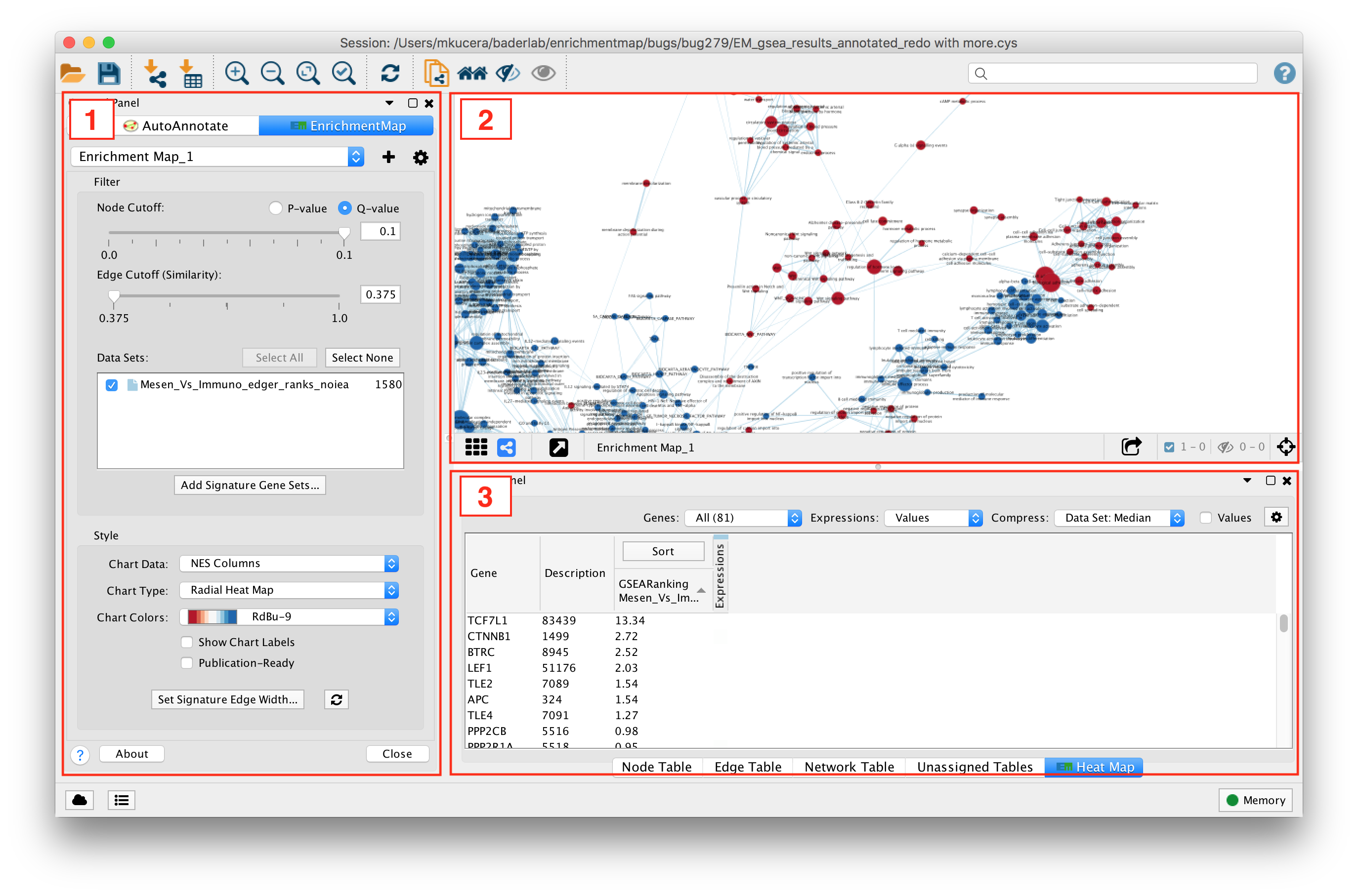
- Main EnrichmentMap Panel
- Used to customize the look of the network in several ways.
- EnrichmentMap Network
- The Cytoscape network view shows the EnrichmentMap network.
- Expression Panel (Heat Map)
- Shows gene expression data for selected nodes and edges.
Interpreting the Network
- Nodes represent gene sets.
- Node size represents the number of genes in the gene set.
- Edges represent overlap between gene sets.
- Edge width represents the number of genes that overlap.
- The default layout algorithm causes gene sets with high overlap to cluster together.
- Each node contains a chart that shows the enrichment scores, such as NES (for GSEA), P-value or FDR Q-value. The enriched phenotype is conveyed by a color gradient. The chart data can be changed using the Style section of the EnrichmentMap panel.
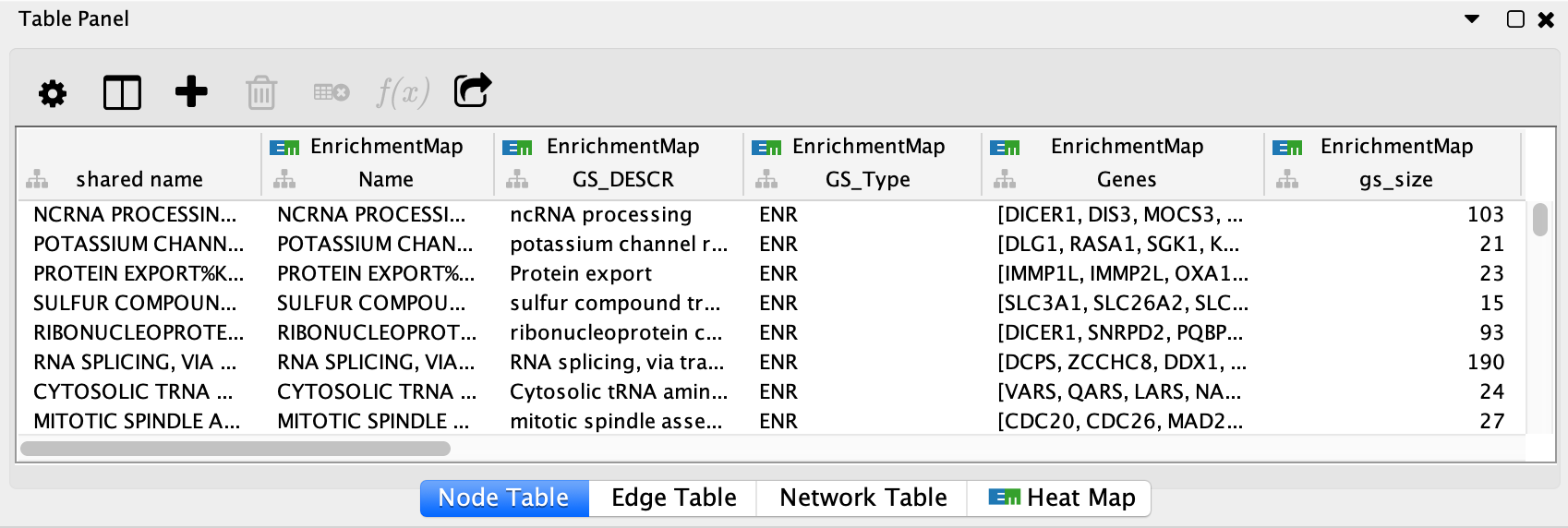
EnrichmentMap creates several columns in the node and edge tables. They can
be seen in the Node Table and Edge Table panels. Columns created by
EnrichmentMap are in the EnrichmentMap namespace.
Note
For more details see Network Visualization.
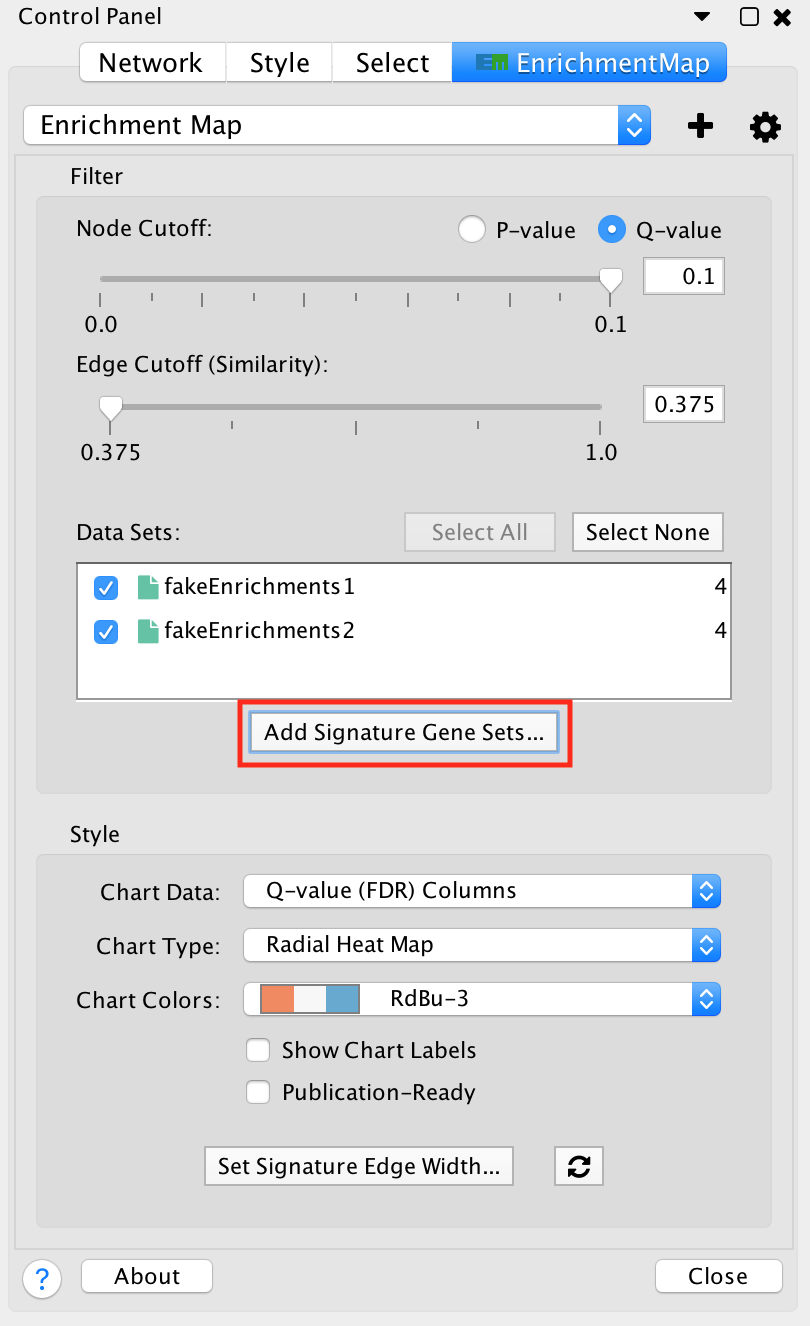
Main EnrichmentMap Panel
The Main EnrichmentMap Panel can be used to customize the network in several ways.
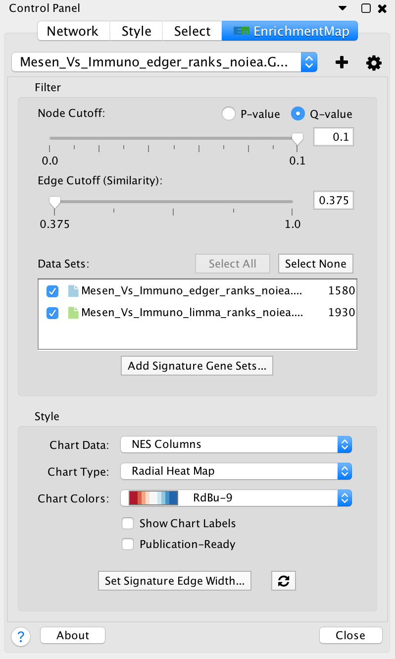
- Filter section
- Node cutoff slider: Nodes with a p-value or q-value that do not pass the cutoff are hidden from view.
- Edge cutoff slider: Edges with a similarity score that does not pass the cutoff are hidden from view.
- Data set list: Lists Data Sets that were used to create the network. De-selecting the checkbox next to the name of a data set causes gene set nodes that are not contained in the data set to be hidden from view.
- Add signature gene sets button: Opens the Post Analysis dialog which is used to add more gene sets to the network.
- Style section
- Chart data: Allows to pick which data columns are used by the node charts (e.g. NES, p-value or q-value).
- Chart type: Various chart visualizations are available.
- Chart colors: Various color schemes are available for the charts.
Note
For more details see Main Panel
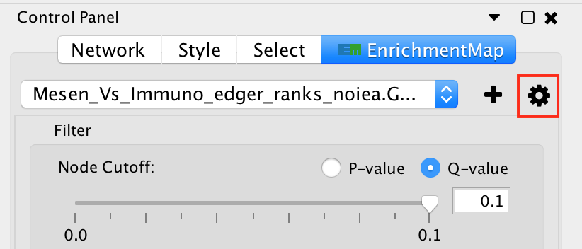
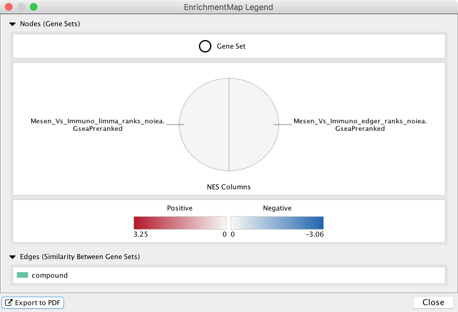
Legend Dialog
The legend dialog can be opened by clicking on the gear icon at the top of the main panel and selecting Show Legend.
The Legend Dialog shows a visual representation of how the network elements can be interpreted, including what data is visible on the node charts. The legend can be exported as a PDF file.
Note
For more details see Legend Dialog
Expression Panel (Heat Map)
The HeatMap panel shows gene expression data for selected nodes and edges.
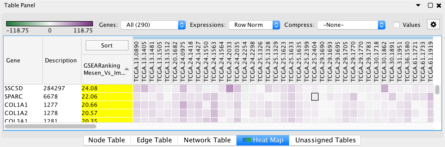
- Genes: You may select multiple gene sets (by selecting several nodes or edges). When more than one gene set is selected you may choose to view all of the genes (union) or just the genes that are common (intersection).
- Expressions: Allows to show the raw expression data or to normalize the data.
- Compression: If there is a large number of expression columns in the HeatMap they can be compressed down to the median, min or max value.
- Show values: When selected shows the actual expression values, otherwise just shows the color gradient.
- The contents of the HeatMap can be exported to a TXT or PDF file.
Note
For more details see Heat Map Panel
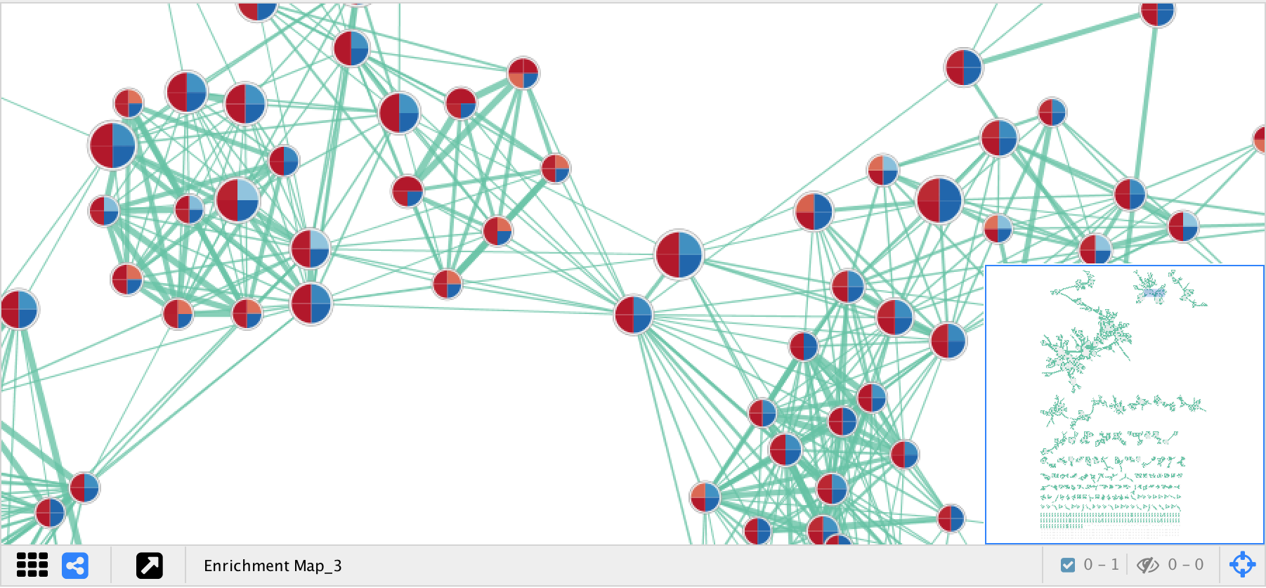
Post Analysis (Add Signature Gene Sets)
The Add Signature Gene Sets panel allows you to add more gene sets to an existing network. This is also called Post Analysis.
To access the dialog click the Add Signature Gene Sets… button on the Main EnrichmentMap panel.
The dialog allows gene set (GMT) files to be loaded from the local file system or downloaded from the web.
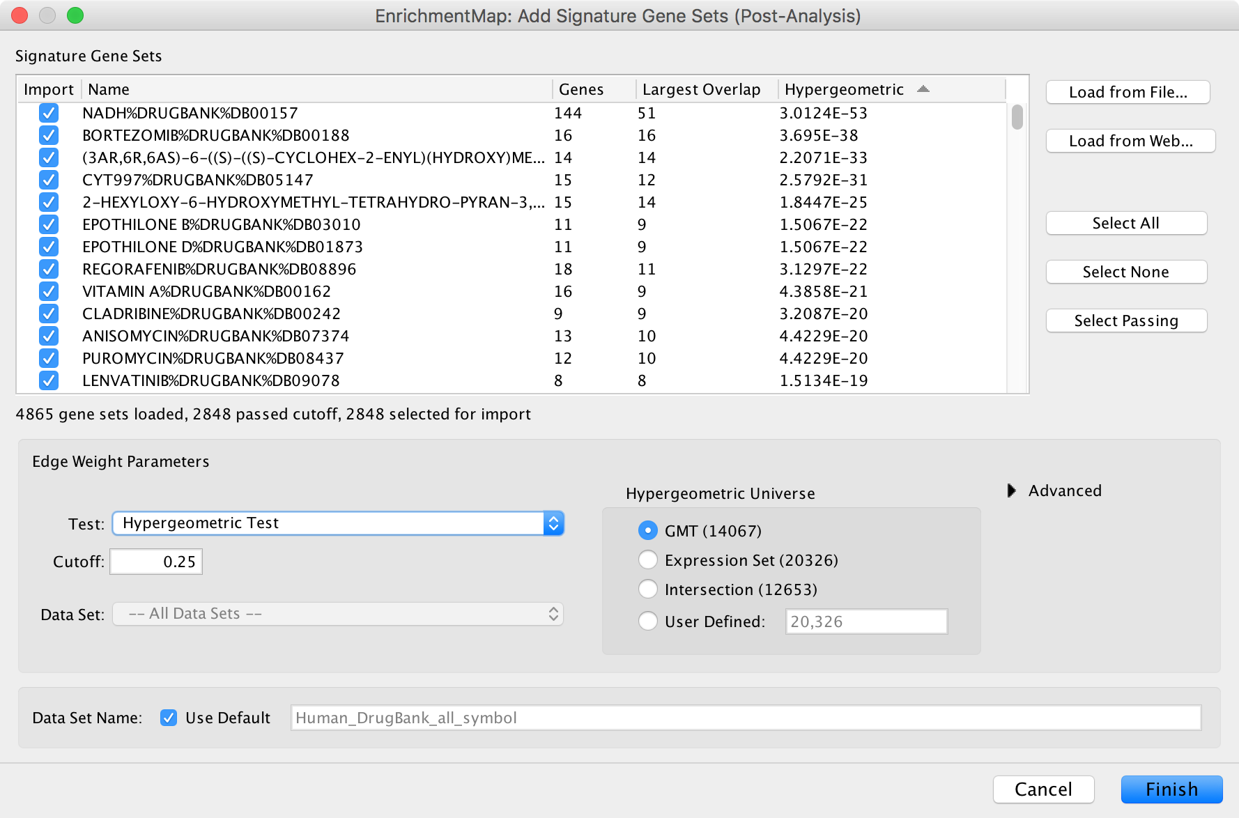
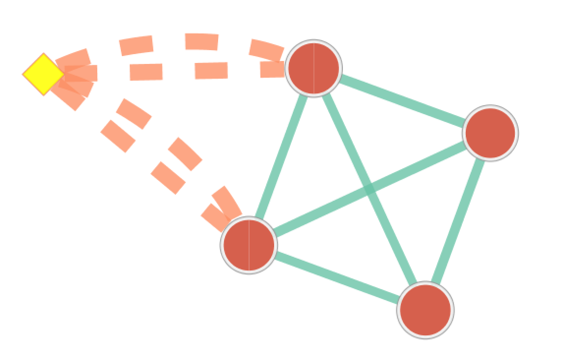
The result of running Post Analysis is a new node for each signature gene set (yellow diamond) and edges from the signature gene set to each existing gene set when the similarity passes the cutoff test. A new data set for the signature gene sets is added to the data set list on the Main EnrichmentMap panel.
Note
For more details see Post Analysis (Add Signature Gene Sets)
EnrichmentMap Protocol
Please see The EnrichmentMap Protocol for details on automating EnrichmentMap.